Showing posts with label cover art tips. Show all posts

Sunday, December 9, 2012

Author beware: 'Custom Cover Design' does not mean 'Original Cover Art'.

by Aidana WillowRaven

So, you've decided you want an unique book cover for your book. You don't want it to look like every other book on the shelf or web browser.

You hop on Twitter or Facebook and put some feelers out, searching for a cover artist or designer. You get dozens and dozens of responses, from both amateurs and professionals. How do you know you are going to get what you want and that it's unique?

 First you must learn a few key terms.

1- cover designer

A designer is typically trained in typesetting and photo-manipulation. Rarely are they traditional artists. Technically, it is an accepted concept that once an image is altered it is a new work, and by law, that is true. All it takes are three distinct changes to make it a new work. If you are looking for something more original than manipulated parts of stock photos that could potentially be used on another book cover, be sure to tell the cover designer you are not interested in using stock imagery. A cover designer may or may not be trained for what you are looking for.

2- cover artist

In years past, publishers hired a cover artist to do the visual art work and a cover designer to do the typesetting and layout. In today's tough job market, more and more designers are doing both the cover art (again, most likely photo-manipulation) and the design under one job. On that same note, more and more illustrators or cover artists are tackling the job of design as well. It is prudent to verify, before trusting your book to anyone, that the people putting your book together are trained and skilled to do what needs done to give you a quality cover. After all, your cover is the first impression.

3- custom vs original

Many designers and websites that boast cheap 'custom' cover designs or art can really be misleading. Again, let's look at the laws regarding art. By law, if an image, including a design, is altered in three ways, it is a new work. If an artists manipulates just two images by combining a figure from one and changing the color of something from another, then all you have to do is add text, then by law that is a custom cover. If that is acceptable to you, by all means save money and use a cover like this. However, some authors want a more detailed, more story-relevant cover, that does not include mixing existing stock imagery. If you are in that group, be sure to hire someone who insures the art is original, not simply custom. You'll pay a lot more, but like the old saying goes, you get what you pay for.

If anybody has questions as to what is considered original vs custom, or the difference between cover design & cover art, please leave comment or contact me at my signature links.


Art Director & VP of Operations

Wednesday, September 14, 2011

When research dictates a re-vamp ...

by Aidana WillowRaven

Sometimes it just can't be avoided.

I try to create a book's cover before starting on a book's illustrations, which gives the author and publisher something to use when building hype for a book's pending release, while I work on the illustrations and layout. But once in a rare while, a cover art and design re-vamp is needed.

One such instance is my latest children's book, Strangers in the Stable by Jim Laughter. It's a sweet little early reader that was extra fun because I got to explore the whole visual interpretation in digital paint vs traditional mediums. I did the cover first, as I usually do, and both the author and publisher loved it (always a good thing ... lol). One problem I learned while doing research for the following illos, I had the architecture all wrong (not such a good thing).

As is often the case, the story itself has a little more room for 'creative license' than the visuals do. The original title said 'Barn,' so I made the setting a barn, as most westerners think of it. Upon further research, I found that not only does ancient Bethlehem not use wood buildings to house their livestock, they also don't refer to such structures as barns. They used, and still use for the most part, stone structures and tents. Not wood and lumber barns ... lol.

Now, many publishers and artists would have just let this pass. As they say, time is money. After all, how many six-year-olds would notice? But 4RV has a high standard, and so do I. My own sense of aesthetic and accuracy just wouldn't let me let it go. So I talked to Vivian, and she agreed, and in a matter of minutes a decision for accuracy over convenience and time was finalized. Re-vamp it was.

And, as with most re-vamps, as much as I grudgingly hate them, I think they always turn out for the better. I assume it's much the same way with authors (dreading edits, but happier with the final result, none the less).

Here is the re-vamped cover. You tell me which one pulls your mental awareness into ancient Bethlehem better? Which one puts you more mentally 'there,' at Jesus' birth? See the difference just the architecture makes when it come to the mood of an illo?

Next question, would you be as willing to go through a re-vamp? Or would you have thought: 'The publisher and author approved it. I don't have time or money for a unnecessary re-vamp. I won't bring it up.'

As artists, especially illustrators, we need to remember even if the illustration 'looks' right, it could still be 'wrong,' and its our responsibility, if we discover an error such as this, to bring it up with the publisher or author. You never know, it may take the book from good to better.

Besides, how often have you criticized the cover artist on their choice of visuals if you know something portrayed way inaccurately? Heck, that's why I took art in college (my pet peeve is proportion, ie: legs too small for the rest of the body, scale wrong, etc).

Try to remember, each piece should be worthy of being 'a portfolio piece.' And misrepresented images are not good portfolio pieces. So when a re-vamp is needed, don't resist. Pull up those sleeves, dig out your tools, and get to work happily, knowing you're about to create visual genius...lol.


Art Director & VP of Operation

Friday, July 8, 2011

Is illustrating a poem or story different than a book cover? Yes & No ...

by Aidana WillowRaven

I belong to various artist networks that, at times, amaze me with the artists' skill & craftsmanship. What's unfortunate, being an Art Director who's always looking for fresh, undiscovered illustrators and cover artists, I rarely find work that convinces me the artist knows what is needed for a good book cover. Sure, many of the works I see are gorgeous, and would make a great wall hanging. Many would be perfect for complimenting a magazine's story or a book's poem, but when I am looking for a potential cover artist, I am not looking for someone I need to coach about bleed, gutter, or negative space for back cover blurb, spinal text, title and byline.

I'm not saying EVERY piece you do has to be cover art ready. After all, it takes a different approach to space and composition, and sometimes as artists, we're just not feelin' it. I get that. But I am saying, if you want to get into the cover art business, the AD has to see that your work could be used for a book's cover without too much extra attention needed by a designer to make it usable. Time is money. And at a standard $45/hour rate, let's show the PH we can save them some money by showing we can create cover art as well as stand alone art. Publishers like it when we save them money ... lol.

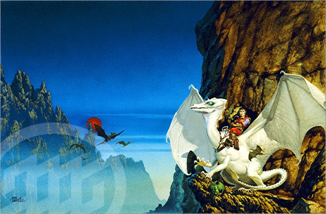
Early in my fine art studies, knowing my eventual goal was to become a fantasy book cover artist, I not only studied the masters (DaVinci, Michelangelo, Renoir, Dali, etc), I also studied fantasy book cover legends, like Micheal Whelan (Dragon Riders of Pern cover artist, among others). He published a couple books containing interviews with various authors he graced covers for over the years. He also shows sketches, and offers commentary, on some of his more popular works that helped turn those books into bestsellers. I still study them when I need inspiration.

If I try to emulate him in any way (since I can't touch him artistically ... lol), it's in his use of composition. I'm paraphrasing a bit, but he states how he tries, while catering to the dimensions and needs for a book's front cover or cover wrap (jacket or paperback potentials), he deliberately sets it in his mind to make the piece stand alone, too. To create a piece of art that just 'happens' to double as an excellent book cover. Well, that 'happens' is no accident. That means a lot of planning goes into composition long before any final painting is done. You can probably guess, that this piece is for a front cover. See the room he gave for title and byline, along with trim room for the printer? Yet, he still follows the laws of a great composition. Those 'negative spaces' are not void of interesting material, they're just non-essential elements - elements that if hidden by text wouldn't affect the main subject in the scene, and will not obstruct good titling. As a matter of fact, I can't be 'certain' this one was a book cover. But if it wasn't, it would surely show an AD that he was fully capable of accommodating one. Wouldn't it?

Now, if you look at the piece to the left, or the White Dragon piece above, it's apparent these would make awesome cover wraps. The central focus is on the right (ideal for front cover use), while the central and left areas, though never lacking in interest or beauty, are obviously not the focus, and would accommodate a spine and back cover info, perfectly.

Notice, again, plenty of room for title, spine and by line.

Now for testing one's own work against a master cover artist. Remember, we are looking at my composition, not comparing my painting ability against Whelan's ... lol (I'm no fool).

Not too long ago, Vivian shared one of her poems with me, and it got my mind a buzzing, This would make an awesome art piece! So I bullied her into letting me illustrate not only that poem, but a gaggle of others similar in mood. Like my unbeknownst mentor, I tried to look at the composition as a cover piece. You never know, she may want to publish the poems and use this work as the cover. So I planned ahead, and set to work.

When Death Sat Next To Me

When Death sat next to me,
I thought she looked familiar.
I asked, "Have we met?"
Elegant and attractive in black,
she offered a sad smile,
her luscious lips glossed in red
tilted slightly at the edges.
"Oh, yes, I've walked many
a long mile by your side."


If you click the image, you can zoom in and get a closer look.
First, I created the main character, Death. The poem describes the hair clearly, so I decided on a sleek dress with dramatic drapery and folds. Something elegant and eternal, out of current fashion, but still glamorous. Frayed at the bottom from eons of dragging the ground, yet silky and flowing. And of course, the scythe was a must. It's Death's calling card, even though the poem never mentions it. In a later post, I'll go into more detail as to why I chose the elements that I did.

My biggest decision was her placement in the scene. I needed her facing the audience, and the 'victim' while encouraging them to maybe open that potential book to see what's inside. Her pose had to not only be sitting, but be graceful, elegant, dark, and alluring. 

While accommodating the details of the poem (this is only the first stanza), I still had to remember to leave negative space for tile and by line, if ever needed. At the same time, I want to make sure if they are not there, that the piece could stand alone, and not feel lacking, in a frame or on canvas. In this instance, the subject matter called for a haze, a sort of obscurity, like the person meeting  Death face to face, notices nothing but her and the grave. This also wasn't spelled out in the poem, but it just 'felt' that way.

Why don't you judge? Look to see if my composition would not only make a believable stand alone piece for a magazine, poem, or frame, but also a potential book cover?

  • Title room: check
  • By line room: check
  • Bleed/ Trim room: check
  • Main elements unaffected by the above needs: check

So how did I score? 

Maybe next time you are planning a composition, with the idea of attracting a publisher or Art Director, you'll compose it as a potential book cover? And maybe, just maybe, your next commission will be as a cover artist.


Aidana WillowRaven


Art Director & VP of Operations
4RV Publishing

Friday, May 20, 2011

"How do I get into the business?"

by Aidana WillowRaven

I get asked this a lot. Artists see that I am a cover artist, and a book illustrator, with over 100 books in print with my work on or in them, and inevitably ask me how I got started.

Honestly, by networking. But how did I know what those that would hire me want to see? And how would I get those that I wanted to see my work, see it?

Again, by networking. But networking to the right people, in the right places, showing the right material is the key. The next few tips apply to authors just as much as artists, just maybe in a slightly different way.
  • 1. READ!
I can't emphasize this one enough. To be a cover artist or illustrator, it takes something more than being able to 'create pretty pictures.' It takes being able to tell a story. If you can't effectively tell a story, whether it be with you art or your writing, you're not going to get too far. And how do you learn how to tell a story? You read. A lot. Then you read some more. It just makes sense, for both authors and cover artists/illustrators.

  • 2. For the artist who wants to be a cover artist or illustrator, you also need to study the covers on your favorite books (even on your not so favorite books). Haunt the library and bookstore.

How does the composition differ for a book rather than for a stand alone piece?
How does it differ from genre to genre?
How does it differ from book style to book style (paperback to hard cover)?
How does this cover tell me what I can expect to find inside?

All these questions must be asked an answered for every book. I mean, admit it, we still judge books by their covers. Regardless of what we're taught.

Now, the best cover artists have learned how to make their art be able to stand alone, while still being suitable for a cover. But how do you know if your work is suitable for a cover?

This is a stand alone original recently done just for my portfolio. Could this double as a book cover? Why or why not?

Is there room for a title? A by line? The blurb on back? The spine? Believe it or not, an Art Director or Editor will be looking at that, just as much as your style, technique and story telling ability, when looking at your portfolio. And when I say 'room', I don't mean blank or negative space. But rather, unimportant elements. Things that can be covered by text without ruining the 'story'.

So back to the first problem. How do you get the Publishers, Art Directors, and Editors to see your work. Work that you have purposefully built to be cover art friendly?

  • 3. Remember that word 'network'? 

  • You read everyday.
  • You work on your art everyday.
  • Now you must mingle everyday.

But who with? I see a lot of artist hanging out with other artists. They put their work up on sites like Renderosity, Deviant Art, Zazzle, ImageKind, and many more. Which is good. But, publishers and Editors rarely lurk in those galleries or forums looking for artist to outsource to. Not never, mind you. But rarely.

  • 4. You need to think of it like a business. Who is my customer? 

  • Authors. 
  • Publishers. 
  • Agents. 
  • Editors. 
  • Art Directors.

So where do you need to hang out? WITH THE CUSTOMERS.

  • Join author groups that welcome outsiders (many do not - so pay attention).
  • Befriend writers, publishers, etc. on Facebook.
  • Follow authors and publishing pros on Twitter.
  • Get TweetDeck, and keep search colomns up of keywords publishing pros use when putting out calls for artists.
  • Lastly ...  PUT YOU WORK EVERYWHERE.

You need to be an artist (or author) first. At least in public networking. Taking about your cat is fine, but what do you want someone to see if they stumble across your FaceBook page? Certainly not how many games you play all day or how you got wasted last night at that party.

Keep it professional at all times. And people will see you as a pro.

  • 5. Oh yeah ... and READ!


Art Director & VP of Operations
4RV Publishing

Friday, April 8, 2011

What Questions Must be Asked & Answered, Before Creating a Novel Book Cover?

Part 3
by Aidana WillowRaven


In my last two posts, the topic has been on how basic cover design rules tend to remain the same from cover to cover, title to title, genre to genre. But, we need to remember there are some important differences, too.

To repeat the original post's paragraph on this topic: “When contemplating what is needed for the cover of any given book, some basic rules apply to every design or composition. You need to know what the title is saying. You need to know what the title isn't saying. And you need to know to whom the author is saying or not saying the title.”

So far, I've used both an Easy Reader and a MG/YA cover as examples of the points being made in this topic. Today, I'll be showcasing a mainstream novel as my example. Let's ask the same questions with the cover I designed.

What is the title saying? What isn't the title saying? Who is the author saying it to? (I’m using 4RV Publishing’s Stolen by Vivian Gilbert Zabel for the example).


What is the title saying? Something has been 'stolen,' obviously. Judging by the font, there is a frightening and chaotic, almost violent mood implied. Since the title is so basic and short, and a little intense, we’re going to have to look at what isn't the title saying to get more clues as to what we'll find inside the book.

What isn't the title saying? Although there are not that many elements on the cover, it is telling us loads of information, giving little hints as to what has been 'Stolen,' and surprisingly (if you pay attention), from whom and where. First, if you look at the 'ground,' you get the hint of wall paper ... of an older style. So this is an old fashioned home, most likely. Second, the wall photos that are askew show us that there has been a struggle or conflict. This conflict, whether it was physical or emotional, is emphasized with the broken glass in the right frame. That frame is a clue in and of itself. It is telling the viewer that the seemingly happy union has been broken, destroyed, shattered. Let's look at the other frame for the third clue. The image is falling from the frame. The siblings are clinging to each other and seem to be at a public place, like a park, as they are being seemingly ripped from the safety of the very ornate frame. The children are represented in a black and white photo rather than in living color, almost like they are a memory rather than in front of us. Even the fancy frame for the kids, vs the more modest frame for the wedding couple, tells us that the children held the primary love and focus of the characters in the book. As you can see, there are a lot more subtleties to an adult novel cover design than that of a child's book or even a young adult book. Even the book's colors a representative. Blue is the author's favorite color, and the book is a fiction based on true events that happened in the author's life. 

To whom is the author saying the title to? Any parent or grandparent, especially a mother or grandmother, are going to immediately key into this cover. It's attacking one of their basic fears and doing it in a seeming 'safe' environment. This is a marriage and family destroyed at the home level. It's personal. It's emotional. It's tragic. The title and cover are warning people to fear what they fear. That monsters are real and that they live in our walls. They come into our homes and the steal our lives, our souls. They try to, anyway.

Next week, the topic will be: 'The Story', as it applies to Cover Art and Illustration. (I’ll be using a promotional piece for 4RV Publishing’s Aldric & Anneliese, by Harry E. Gilleland, Jr, for the example.)


Aidana WillowRaven
Art Director & VP of Operations
4RV Publishing

Friday, April 1, 2011

What Questions Must be Asked & Answered, Before Creating an MG/YA Book Cover?

Part 2
by Aidana WillowRaven

In my first post on this topic, I touched on the fact that basic cover design rules tend to remain the same from cover to cover, title to title, genre to genre. But we need to remember there are some important differences, too.

To repeat the opening paragraph from part one of this topic: When contemplating what is needed for the cover of any given book, some basic rules apply to every design or composition. You need to know what the title is saying. You need to know what the title isn't saying. And you need to know to whom the author is saying or not saying the title.

Last week, I started my example using an Easy Reader cover. Today, I'll be showcasing an MG/YA (middle grade, sometimes also considered "tween"/young adult), in my example. Let's ask the same questions with an MG/YA cover I designed.

What is the title saying? What isn't the title saying? Who is the author saying it to? (I’ll be using 4RV Publishing’s Just Breeze by Beverly Stowe McClure, for the example).


What is the title saying? Just Breeze, hmmm. 'Just' anything hints to the idea of commonness, normalcy, nothing special or extraordinary. But, would there even be a book about something that was 'just' anything? Especially a breeze? Regardless of what the story is about, it needs to be, well, 'just' a cover. So, I kept the background plain. But how do I make a plain background interesting? I decided to position the character in an unusual pose and have her acting bored or distracted. It makes the viewer want to know what she is thinking about. It gives them a reason to open the cover and look inside. I even have her eyes leading the viewer towards the opening edge of the cover.

What isn't the title saying? Here is where little hints about the story comes in. But unlike with the children's book I discussed last week, where the only real hint was the giraffes, there are several hints about what is to be discovered inside. This is targeting an older audience, 10 to 14-year-old’s. It needs to be a little more complex, while still remaining simple, or 'just.' Breeze is really the main character’s name. The story isn't about a type of light wind at all. It's about Breeze, the girl. So naturally, she has to be included on the cover. In order to maintain that lonesomeness, or singleness that 'just' implies, I drew only her. Not her friends or family. I also used a font similar to varsity or junior varsity lettering to show a lot of her life and self image revolves around school and her friendships.

To whom is the author saying the title to? As I mentioned above, the book is targeting 10-14-year- old’s. More importantly, the book is targeting girls. Girls who feel 'just' anything. Just plain, or awkward, or too tall, or too short, or .. well … just about every 10-14-year-old girl out there. They feel alone; they feel isolated; they feel plain. Breeze thinks her hair is too wild, too red. So the hair was a major element that needed close consideration. Breeze wears braces, braces with blue rubber-bands (which also matches her blue finger and toe nail polish). She's different. But the final hint about the story is that she's gorgeous! I didn't draw an awkward, gangly, pimply, messy-haired kid. I drew her precisely how everybody else sees her, but herself. She's beautiful. That is the most important part in the portrayal of her character.

Next week, we'll look at a more advanced read/genre, a mainstream novel. (I’ll be using 4RV Publishing’s Stolen by Vivian Gilbert Zabel, for the example).


Art Director & VP of Operations
4RV Publishing

Friday, March 25, 2011

What Questions Must be Asked & Answered, Before Creating a Children's Book Cover?

Part 1
by Aidana WillowRaven

When contemplating what is needed for the cover of any given book, some basic rules apply to every design or composition. You need to know what the title is saying. You need to know what the title isn't saying. And you need to know to whom the author is saying or not saying the title.

For example, I will use a children's Easy Reader, I illustrated and designed, about a little boy and his day at the zoo. What is the title saying? What isn't the title saying? Who is the author saying it to? Let's look at it (I’ll be using 4RV Publishing’s Being Jacob: A Day at the Zoo by Suzy Koch):


What is the title saying? It's saying this story is about what life is like 'Being Jacob' and what happens when he spends 'A Day at the Zoo'. It may seem pretty basic, but I still have to mention it. Obviously, we need to see Jacob, the main character of the series, and we need to see something that is typically only seen at the zoo. Jacob, an exotic zoo type animal or two, and the enclosure to the animal's habitat, clearly depicts a kid not on safari, or in his back yard, but at a zoo. There could be more elements, but be careful not to over do a cover with too many objects or characters, especially for kids. We want to get the point across without over shadowing the title.
 

What isn't the title saying? It isn't saying Jacob is excited about a giraffe. That is a visual hint about something specific in the story. Yes, giraffes are typical to most zoos, and, yes, I could have drawn a gorilla family, but I chose the giraffes, specifically the mother and baby giraffes, because of a special situation in the story. Think of it as a subliminal message, in a way.


To whom is the author saying the title to? Look at the font (which should also match the genre and story – It's part of the over all piece). It's written much like a little kid would write. A bit sloppy, some letters over powering other letters, etc. The author (and publisher) want the smaller kids to relate to this cover. It looks like it's 'written for them, by one of them.' Look at the scene's colors. High contrast. Bright against dark. Kid's are naturally attracted to high contrast. People often mistake this idea to mean primary colors. That works, too, for some pieces and styles, but when a realism style is being used, 'real life' colors, just maybe intensified, should be used, too. We want the reader to see this boy as a 'real' kid, like them, not a cartoon character. Primary colors that are used in excess will give that cartoon impression, and will attract more preschoolers, rather than 6-8 year olds. Which comes to the last point: This book is targeting Easy Readers (also known as Early Readers). That is ages 6-8 or sometimes 8-10, depending on word count and the main character's age. The artist must know what attracts readers of what ages. What colors, what styles, what themes. The artist also needs to know who is ultimately buying that book. A parent. So they have to know how to catch his/her eye, too.


Next time (two Friday's from today), we'll look at a more advanced reader/genre, MG/YA (middle grade/young adult), and go over 'What Questions Must be Asked & Answered, Before Creating a Children's Book Cover?'. I’ll be using another book I designed, and did the cover art for, 4RV Publishing’s Just Breeze by Beverly Stowe McClure, for the example. 


Aidana WillowRaven
Art Director & VP of Operations
4RV Publishing