I belong to various artist networks that, at times, amaze me with the artists' skill & craftsmanship. What's unfortunate, being an Art Director who's always looking for fresh, undiscovered illustrators and cover artists, I rarely find work that convinces me the artist knows what is needed for a good book cover. Sure, many of the works I see are gorgeous, and would make a great wall hanging. Many would be perfect for complimenting a magazine's story or a book's poem, but when I am looking for a potential cover artist, I am not looking for someone I need to coach about bleed, gutter, or negative space for back cover blurb, spinal text, title and byline.
I'm not saying EVERY piece you do has to be cover art ready. After all, it takes a different approach to space and composition, and sometimes as artists, we're just not feelin' it. I get that. But I am saying, if you want to get into the cover art business, the AD has to see that your work could be used for a book's cover without too much extra attention needed by a designer to make it usable. Time is money. And at a standard $45/hour rate, let's show the PH we can save them some money by showing we can create cover art as well as stand alone art. Publishers like it when we save them money ... lol.
Early in my fine art studies, knowing my eventual goal was to become a fantasy book cover artist, I not only studied the masters (DaVinci, Michelangelo, Renoir, Dali, etc), I also studied fantasy book cover legends, like Micheal Whelan (Dragon Riders of Pern cover artist, among others). He published a couple books containing interviews with various authors he graced covers for over the years. He also shows sketches, and offers commentary, on some of his more popular works that helped turn those books into bestsellers. I still study them when I need inspiration.

If I try to emulate him in any way (since I can't touch him artistically ... lol), it's in his use of composition. I'm paraphrasing a bit, but he states how he tries, while catering to the dimensions and needs for a book's front cover or cover wrap (jacket or paperback potentials), he deliberately sets it in his mind to make the piece stand alone, too. To create a piece of art that just 'happens' to double as an excellent book cover. Well, that 'happens' is no accident. That means a lot of planning goes into composition long before any final painting is done. You can probably guess, that this piece is for a front cover. See the room he gave for title and byline, along with trim room for the printer? Yet, he still follows the laws of a great composition. Those 'negative spaces' are not void of interesting material, they're just non-essential elements - elements that if hidden by text wouldn't affect the main subject in the scene, and will not obstruct good titling. As a matter of fact, I can't be 'certain' this one was a book cover. But if it wasn't, it would surely show an AD that he was fully capable of accommodating one. Wouldn't it?

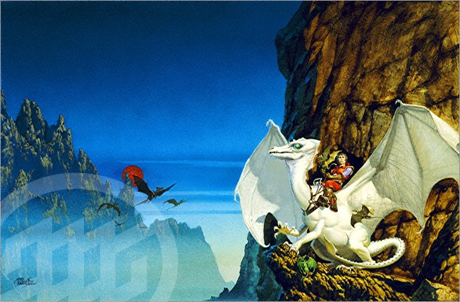
Now, if you look at the piece to the left, or the White Dragon piece above, it's apparent these would make awesome cover wraps. The central focus is on the right (ideal for front cover use), while the central and left areas, though never lacking in interest or beauty, are obviously not the focus, and would accommodate a spine and back cover info, perfectly.
Notice, again, plenty of room for title, spine and by line.
Now for testing one's own work against a master cover artist. Remember, we are looking at my composition, not comparing my painting ability against Whelan's ... lol (I'm no fool).
Not too long ago, Vivian shared one of her poems with me, and it got my mind a buzzing, This would make an awesome art piece! So I bullied her into letting me illustrate not only that poem, but a gaggle of others similar in mood. Like my unbeknownst mentor, I tried to look at the composition as a cover piece. You never know, she may want to publish the poems and use this work as the cover. So I planned ahead, and set to work.
When Death Sat Next To Me
When Death sat next to me,
I thought she looked familiar.
I asked, "Have we met?"
Elegant and attractive in black,
she offered a sad smile,
her luscious lips glossed in red
tilted slightly at the edges.
"Oh, yes, I've walked many
a long mile by your side."
 |
| If you click the image, you can zoom in and get a closer look. |
First, I created the main character, Death. The poem describes the hair clearly, so I decided on a sleek dress with dramatic drapery and folds. Something elegant and eternal, out of current fashion, but still glamorous. Frayed at the bottom from eons of dragging the ground, yet silky and flowing. And of course, the scythe was a must. It's Death's calling card, even though the poem never mentions it. In a later post, I'll go into more detail as to why I chose the elements that I did.
My biggest decision was her placement in the scene. I needed her facing the audience, and the 'victim' while encouraging them to maybe open that potential book to see what's inside. Her pose had to not only be sitting, but be graceful, elegant, dark, and alluring.
While accommodating the details of the poem (this is only the first stanza), I still had to remember to leave negative space for tile and by line, if ever needed. At the same time, I want to make sure if they are not there, that the piece could stand alone, and not feel lacking, in a frame or on canvas. In this instance, the subject matter called for a haze, a sort of obscurity, like the person meeting Death face to face, notices nothing but her and the grave. This also wasn't spelled out in the poem, but it just 'felt' that way.
Why don't you judge? Look to see if my composition would not only make a believable stand alone piece for a magazine, poem, or frame, but also a potential book cover?
- Title room: check
- By line room: check
- Bleed/ Trim room: check
- Main elements unaffected by the above needs: check
So how did I score?
Maybe next time you are planning a composition, with the idea of attracting a publisher or Art Director, you'll compose it as a potential book cover? And maybe, just maybe, your next commission will be as a cover artist.
Aidana WillowRaven
Art Director & VP of Operations
4RV Publishing
4RV Publishing
As someone who helps authors promote and market their books, I can appreciate all that you have shared. Your article is filled with wisdom. I also loved the illustrations which are highly professional, exciting, eye catching and simply awesome.
ReplyDeleteScore: Great !!! and I say great because your best work is still ahead of you.
Thanks for using the illustration for my poem as one of your examples. Also, thanks for using only part of the poem so it hasn't been published. I do want to enter it in at least a contest or two before it's published.
ReplyDeleteVivian
I always knew it was a treat to watch your art, but now I find it is equally interesting to read your writing !
ReplyDeleteThanks, Puro. I try to keep my posts relative to what's going on in the publish realm, from an artist's perspective. At least in my little corner, anyway. ;)
ReplyDeleteThank you, CBM. I can only do my best. :)
Well, Viv. My original idea for this post, was simply what composition is, in art. But since I was in composition mode already, for your piece, and the article sort of morphed ... lol.
Thanks, Sandip. I try to at least not embarrass my publisher ... lol. I doubt I'll ever consider myself 'a writer'. lol
I can certainly see that as a possible book cover. It sure catches my eye. It's remarkable, as all your work is, Aidana. It fits very well with the poem, which Vivian has written so beguilingly.
ReplyDeleteNote the use of blue in the woman facing Death. My favorite color.
ReplyDeleteA great article, Aidana. I never reaolized how much work and thought went into creating artwork for a book cover. So much to consider.
ReplyDeleteThanks, Connie. I hope she does end up publishing the poems. I would illustrate each one. Wouldn't they make a cool coffee table book, or a calendar?
ReplyDeleteViv, my original composition only had Death facing the viewer. The 'victim' wasn't in the scene. But once I realized that wouldn't work, I patterned the woman after some of your traits, even though she doesn't look like you. The blue-grey tones of the backdrop is to emphasise the blue, too.
Beverly, I have been putting even more thought on your upcoming cover. There are so many ways to go. Do I include the charachter, or just key elemens from the story? A full scene, or go abstract? There is so much to descide on ... lol.
Thanks for commenting, everybody.